
How to set an Active List Item Link Material UI
Learn how to style and set the active link in this Material-UI Tutorial


Wondering how to set or style the active link in Material-UI? This Material-UI tutorial will teach you how to style an active drawer / tab item with simplest code possible.
The Mui AppBar and Drawer provide a great starting point - but they don't provide a solid foundation for highlighting the active tab. As a result, many developers end up with 'hacky' methods of setting active nav items. Fortunately, there's a better way.
Demo
Live Site
Codesandbox Demo
Github Repo
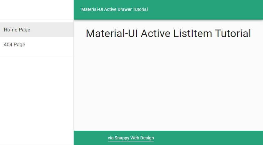
Preview:
Boilerplate (Starting Point)
import React from "react"
import { Link } from "gatsby" OR "@material-ui/core/Link"
import Drawer from "@material-ui/core/Drawer"
import List from "@material-ui/core/List"
import ListItem from "@material-ui/core/ListItem"
import ListItemText from "@material-ui/core/ListItemText"

export default function MuiDrawer() {
  return (
      <Drawer variant="permanent" anchor="left">
        <List>
          <ListItem button component={Link} to="/">
            <ListItemText primary="Home" />
          </ListItem>
          <ListItem button component={Link} to="/404">
            <ListItemText primary="404" />
          </ListItem>
        </List>
      </Drawer>
  )
}
The Solution:
To set the Active ListItem in the Material-UI Drawer, we can use the selected prop. To make this as clean as possible, we should make a custom ListItem. Here's what it looks like:
  let CustomListItem = ({ to, primary }) => (
    <ListItem
      button
      component={Link}
      to={to}
      selected={to === location.pathname}
    >
      <ListItemText primary={primary} />
    </ListItem>
  )
Now we can render our CustomListItem as follows, which will automatically set the Drawer ActiveItem based on the browser's location.
<CustomListItem to="/" primary="Home Page" />
Final Code
Here's how the Drawer looks in its final form:
import React from "react"
import { Link } from "gatsby"
import { useLocation } from "@reach/router"
import Drawer from "@material-ui/core/Drawer"
import List from "@material-ui/core/List"
import ListItem from "@material-ui/core/ListItem"
import ListItemText from "@material-ui/core/ListItemText"

export default function BarebonesDrawer({ children }) {
  const location = useLocation()

  let CustomListItem = ({ to, primary }) => (
    <ListItem
      button
      component={Link}
      to={to}
      selected={to === location.pathname}
    >
      <ListItemText primary={primary} />
    </ListItem>
  )

  return (
      <Drawer variant="permanent" anchor="left">
        <List>
          <CustomListItem to="/" primary="Home Page" />
          <CustomListItem to="/404" primary="404 Page" />
        </List>
      </Drawer>
  )
}
Finished Product
Bonus: Styled Material-UI Drawer
Need a quick copy and paste? Here's the code for the styled Drawer in the demo above:
View on Github
Did you find this article helpful?
If you did, would you take a second to share the article by clicking below? It helps our cause immensely!
Make sure to also click the follow button to get notified when new posts go live 🔔


More from Snappy Web Design
Subscribe to the Snappy Web Design Blog to get notified when a new post goes live. We'll never share your e-mail address or use it for any reason other than to share new posts.
Published May 5
Discover the secrets to designing a website that speaks to your small business's unique identity


michigan small business website design features
As a website developer in Michigan, I’ve worked with many small business owners looking to redesign their websites to increase sales and connect with new and existing customers. As such, I’ve seen what works and what doesn’t work and cultivated a list of valuable tips that I give to all my clients.
As a small business owner in Michigan, your website is frequently the first impression that customers have of your company. It’s essential that your website is not only visually appealing an...
Published September 1
Snappy Web Design is the one-stop-shop for web design.


We Provide Michigan Website Design Services
Michigan's Newest Web Design Company
You search Google for “Michigan web design” and find my site. I’m Joe, and I’m the head developer at Snappy Web Design. I’m the new guy on the block, and an expert in providing full-service web design for small business owners in MI.
I’m different from typical web design agencies because I aim to be your partner for all things related to your onli...
Published August 0
A horrifying trip through poor UX design


Visit this website and you’ll be infiltrated by three separate popup modals and two banners urging you to sign up for something. You’ll be forced to sequentially close the popups and banners to actually see the text on the page. One modal, fine - but three of them? And two banners? A bit excessive. The worst is yet to come ...